Zeiss Otus 1.4/55mm APO Distagon T* Review
Dustin Abbott
June 3rd, 2015
People have long chosen large aperture primes for the unique look and (surprisingly) versatility that they offer. Versatility, you might ask? Wide aperture primes will often offer two full stops of extra aperture choices over the widest available aperture on a zoom. This gives you potentially six different choices of aperture value unavailable to you on an f/2.8 lens, not to mention two full additional stops of light gathering with an f/1.4 lens like this one. In many cases you can zoom with your feet, but you cannot magically open the aperture of a zoom lens wider than its maximum aperture and create those amazing shallow depth of field looks. Nor can you always introduce additional light into a scene. The low light performance of prime lenses is exceptional, and, as I mentioned, there is unique look to a prime lens due to the wider aperture. But there is often a downside to using prime lenses wide open. They frequently suffer from a lack of contrast and sharpness wide open, and the image quality is sometimes marred by obvious chromatic aberrations and fringing. But what if you could have your cake and eat it too?
Zeiss engineers were given a simple brief several years ago: design the best standard lens in the world. No restrictions on price or size. They were given access to new and exotic materials, and what came out of their design rooms was the best standard prime lens the world had seen – the Zeiss Otus APO Distagon T* 1.4/55mm. What if you could have perfect sharpness from corner to corner even wide open at f/1.4? What if you could have perfect, inky contrast at f/1.4? What if you could have image quality without chromatic aberrations? And what if you could have all that while maintaining beautifully creamy, artful bokeh rendering to boot? Well, assuming you have deep enough pockets (and don’t mind manually focusing), you can literally have it all with the Zeiss Otus 1.4/55.
This is not my first trip in the Otus dream boat. I spent some time with the Otus 1.4/85mm last fall and came away more impressed by it than any lens before it. It was simply amazing. Could the (slightly) smaller brother impress me in a similar way?
Build Quality, Specifications, and Handling
The sharp eyed among you might have noticed a curious thing about the name of the Otus 55. All of Zeiss’ other 50mm options are Planars. I own an older Planar T* 1.7/50, and have tested both the Planar T* 1.4/50mm and the Makro-Planar 2/50mm. This lens is a Distagon. All previous Distagons that I have tested have been wide angle lenses (2.8/15mm and 2.8/21mm). To get to the bottom of this I asked Richard Schleunling, Senior Director of Zeiss North America. He said, “The Distagon design style is more complex than the Planar and allowed for the use of more lens groups. These groups provide the unique control of distortion and lens aberrations that was impossible to do with the existing 50mm Planar design.”
The Otus 55 is certainly nothing like the Planar T* 1.4/50mm. All they share is the same aperture and roughly the same focal length. Beyond that they are different in almost every way. The 1.4/50mm is small and compact and reasonably priced (for a Zeiss). Its image quality wide open is what we euphemistically call “dreamy”, and the less charitable would just call it “soft”. I still enjoyed using it, appreciating it for what it was. But the Otus 55 is a whole other beast. It is not small or compact and most certainly not inexpensive. It is big, heavy, and sharp like you cannot believe.
That new optical design (12 elements in 10 groups) has certainly achieved the principle purposes, as the Otus 55 exhibits no visible chromatic aberrations and has almost zero distortion. Part of this is achieved through the use of a floating element system along with Zeiss’ world famous optical glass and exceptional lens coatings. If you don’t need a wider angle of view it is a perfect tool for architectural work due to the non-existent distortion.
The only optical shortcoming that I have found so far is a fairly heavy vignetting that I didn’t notice with the Otus 85. This may be due to the Otus 55 using a standard 77mm front element (not exceptionally large) compared to the larger (and somewhat unusual) 86mm front element on the Otus 85. I think that many would find this trade off acceptable in order to be able to use their standard collection of filters. The vignette can be a desirable quality in certain applications, but I prefer to selectively add vignette in post where appropriate. Image quality is otherwise essentially perfect wide open. If you want to stop down, it will be for depth of field, not because of any additional sharpness. This wide open shot shows the vignetting from the Otus 55:
In many applications the vignetting can produce a desirable effect, or it is easily correctable in post.
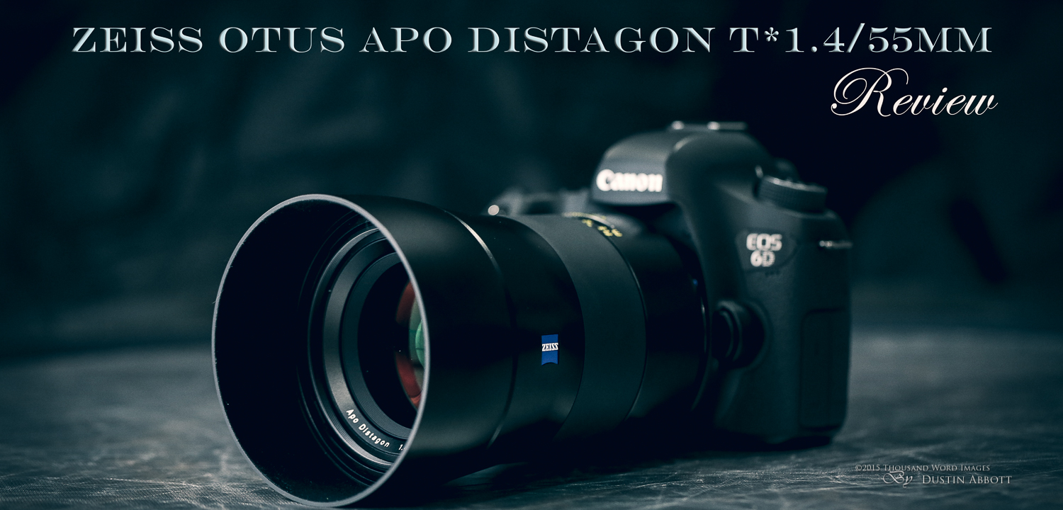
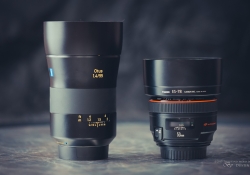
Put the Otus up next to just about any other 50mm option (at least for the 35mm system) and it will come across as being large (it is 5.66”/143.8mm long), heavy (2.27lb/1030g), and expensive (just south of $4000). It will also be the best lens in the room. I made the point in the Otus 85mm review that the Otus lenses really need to be compared more to medium format systems (because of their resolution) and to gain a more realistic view at their price. The size is daunting only compared to other 50mm lenses. It is roughly the size of a 24-70mm f/2.8 lens, although a bit larger and heavier.
Before going further, let me acknowledge that the Zeiss Otus lenses are not for everyone. Their high price tag, manual focus only design, and overall dimensions preclude them for being a “lens for everyman”. I ironically had the new Canon EF 50mm f/1.8 STM at the same time; you could buy 32 of those lenses for the price of one Otus. That may seem ridiculous, but in our world you can also buy a similar amount of Nissan Micras for the price of one Bentley Mulsanne. If a lens like the Otus 55 makes no sense to you, that’s okay. Just do yourself a favor and never try one…because the experience might be a bit addicting.
The Otus 55 is a manual focus only lens. In the Canon (ZE) mount, the aperture iris is electronically controlled and so aperture is handled in the same fashion as any other modern lens. The Nikon mount (ZF) also includes a manual aperture ring, though the iris can also be electronically controlled. The lens does have electronic coupling to the camera body, so not only is EXIF data shared normally but there is also a focus confirm chip that will beep and highlight the correct AF point when focus is achieved. The manual focus ring itself is wide and rubberized and incredibly smooth. It has the perfect damping that allows you to focus with a finger but without too much looseness that would make fine focus more challenging. If every manual focus lens focused like an Otus people might have a fresh appreciation for manual focus lenses.
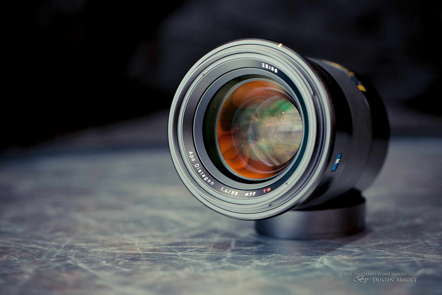
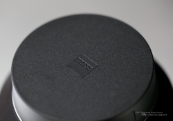
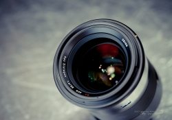
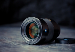
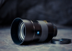
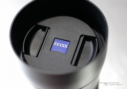
Everything else in the Otus 55’s construction is glossy, metal curves. It has a very elegant design, with a semi-gloss finish and a blue “Zeiss” badge on either side of the barrel. Even the design of both lens caps is premium and unique to the Otus line. There is a distance scale along with a hyperfocal guide. As you might expect from a lens purposefully designed for manual focus, the focus throw is appropriately long with enough room to make fine adjustments at every distance. I primarily used a Canon EOS 6D body with an EG-S focus screen installed (for manual focus) and between the smooth focus ring, feedback from the focus confirm, and the easier visual focus confirmation from the EG-S I was able to get consistently focused results.
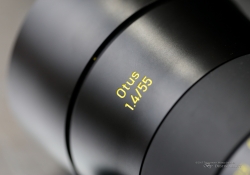
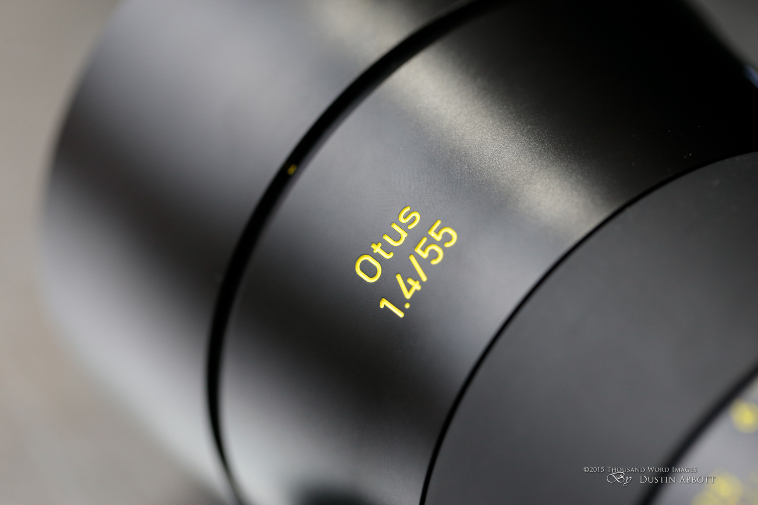
The rest of the lettering on the lens is etched into the barrel and then painted a bright yellow color. I found this disconcerting at first, but the purpose is to have maximum visibility on the distance scale when the lighting is low. It is functional, but does somewhat detract from the overall minimalist elegance of the design.
Finally, I really like the way that the lens hood is designed for the Otus line. It essentially an extension of the overall design, and actually completes one of the elegant curves of the lens. The interior of the hood is flocked to absorb stray light from bouncing around and hitting the front element. The way the lens hood flares (and the fact that it is so sturdy) really makes it a natural place to support the lens with your free hand. It’s an easy lens to shoot with, and the hood does reverse nicely despite its natural flare.
One critique that I would like to offer is that it is inexcusable to me that a lens that costs this much should come without a padded case for transport. Yes, the box for the Otus lenses is custom molded and does provide some protection, but few people are going to use it for transport, not to mention the fact that the box would soon get beaten up. Zeiss should take a look at the nice, functional padded cases that Sigma includes with all of their lenses. One shouldn’t have to spring for a padded lens case after spending $4000 on lens.
Comparisons and Image Quality
First of all, there are few genuine comparisons for the image quality you get from the Otus 55. Look at this photo of a handsome dog, and then at the crop.
That is f/1.4. f/1.4! Where else can you find resolution like that?
I directly compared the Otus to the flagship 50mm lens from Canon, the EF 50mm f/1.2L. I praised that lens in many ways, and I do think it has more to offer than some have given it credit for. You can read my review of it here: But at the same know that in every measurable head to head comparison (other than autofocus!) it was no contest. The Otus simply destroys it. The Sigma 50mm f/1.4 ART series lens is somewhat better competition in terms of sharpness, and (to a lesser extent) contrast, but in overall image quality it falls short of Otus. The Sigma ART is a very nice lens, but, ironically, it isn’t nearly as “artful” as the Otus 55. The Otus has not only the biting sharpness and overall contrast but also adds a truly beautiful out of focus rendering that just seems to produce more “creaminess” than any of the lenses I stacked it up against. Look at this comparison series that I shot: yes, the Otus has a 5mm difference in its focal length, so it produces slightly more diffusion of the background, but that alone cannot account for the quality of the defocused region. It is producing softer bokeh despite the Canon’s slight aperture advantage (f/1.2 vs. f/1.4).
Here is a direct comparison series. The first is the Canon at apertures from f/1.2 to f/4.
Secondly, here is the Zeiss Otus 1.4/55mm comparisons from f/1.4 to f/4.
The drawing from the Otus is a rarity, for many modern lenses that emphasize sharpness and highly controlled chromatic aberrations often cross a line where the image quality becomes a bit more clinical and with less…well…personality. The Otus 55 allows you to have both, and that makes it extremely unique. The lens also has extreme contrast that blows other lenses out of the water. I often use a torture test with text that quickly betrays a lens’ lack of microcontrast, but the Otus does a great job of producing inky looking text even wide open:
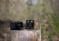
That micro-contrast, combined with the fabulous resolution even at f/1.4 allows you to shoot very unique portrait shots that have an extreme three dimensional effect that makes images from the Otus instantly recognizable. Portrait shots ooze quality, and it is one of the main reasons that high end portrait shooters should seriously consider this lens. Take a look at this completely untouched series with a couple of young models and some of my vintage cameras – note the amazing three dimensional effect here.
I used it at a couple of weddings for posed shots, and it is obviously an amazing tool in that kind of venue as well. I used it to supplement my usual tools – stabilized f/2.8 zooms – and while they are still my weapons of choice, the Otus shots do have a beautiful look to them.
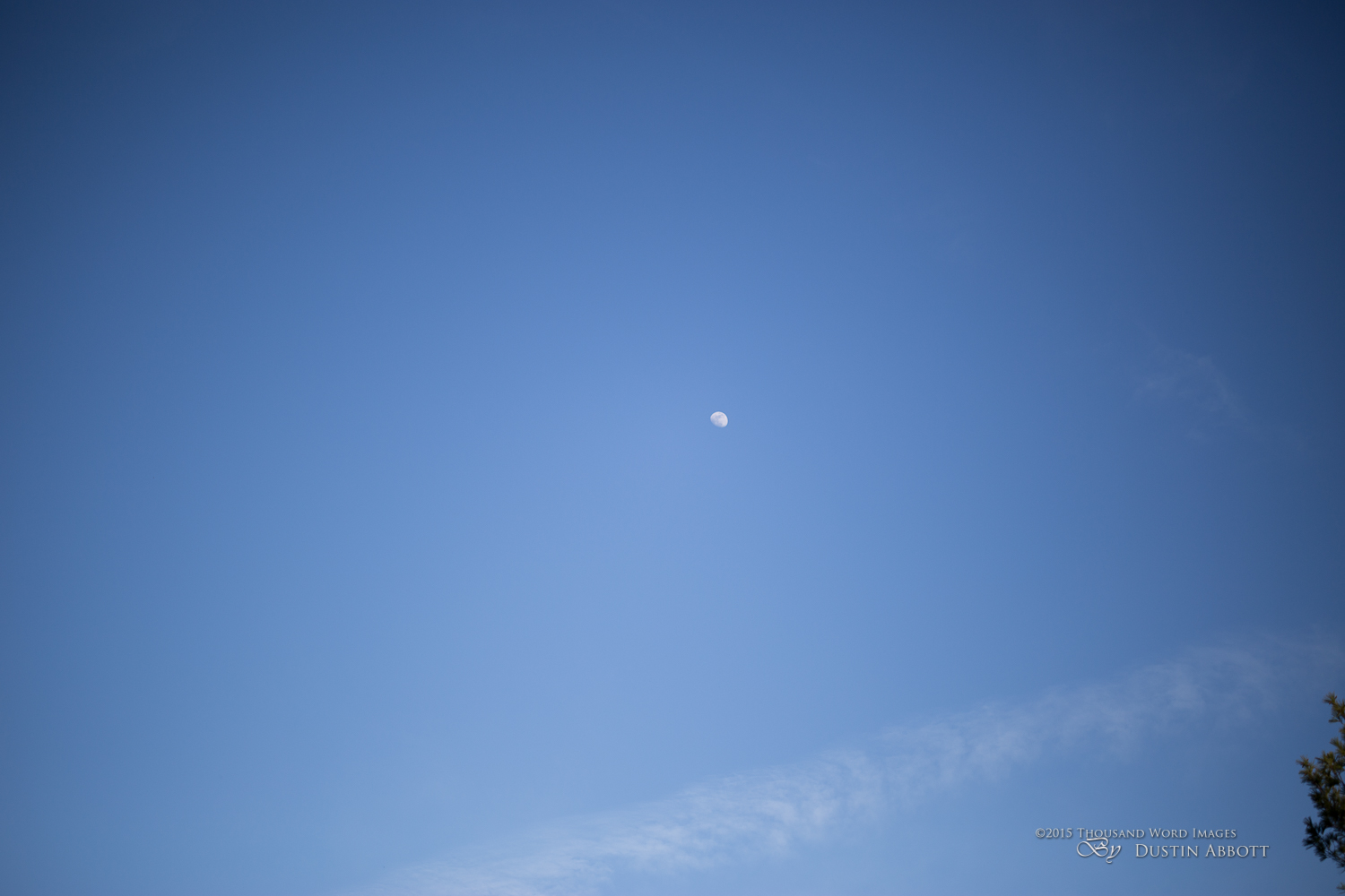
One other thing that I’ve noticed is that the Otus lenses don’t seem to have the limitation where the sharpness is inconsistent across the focus range. I have discovered that most prime lenses have a “sweet spot” where they are optimized to produce their best results at wide apertures, but are often far less impressive at other focus distances. Where this is really born out is when you focus towards infinity. Many wide aperture primes are simply not optimized for this type of shooting, and, as a result, texture resolution and contrast are lacking. I found this to be true even with the Sigma, which impressed me wide open at close to medium distances but was less impressive at long distance. This is even truer with the Canon 50L. The Otus lenses, by contrast, are sharp and “contrasty” at any focus distance. Take a look at this f/1.4 shot at infinity focus; it is amazing sharp from corner to corner.
Here are a few other landscape type shots taken at f/1.4:
Once you have become familiar with the lens, images from it are instantly recognizable because of the intense contrast and resoltuion. The lens shows a tremendous three dimensional effect due to that contrast, the sharpness on your subject, and the incredible delineation of your subject from the background.
I’m not a chart tester, but if you can to take a look at some the chart testing out there you will find that the Otus 55 raised the bar for what was possible in resolution at this focus length (or pretty much any other around it).
Color rendition is always a strength for Zeiss lenses, and the Otus line just takes it to a new level. Images require very little post-processing because the colors are already great and the contrast is naturally exceptional. I should also note that I was almost unable to produce flare ghosting or artifacts even when the sun was placed directing in the frame.
I love the bokeh produced by this lens in real world use, and was somewhat surprised to find that when I tested the quality of the bokeh using my technique of using Christmas lights to produce bokeh highlights that, while the bokeh highlights are nice, soft, and large, there is a definite “onion pattern” of concentric circles within the highlights. This series goes from f/1.4 to f/5.6:
At f/4 you can begin to faintly see a slightly non-rounded shape produced by the nine-bladed aperture. This reinforced the reality that while this test is interesting for testing aperture shape, it is hardly conclusive when determining the real world quality of bokeh. I have yet to see the onion pattern in any real world photos. In fact, the lens’ complete lack of chromatic aberrations means that the bokeh is not plagued by the odd color fringing that often affects the bokeh in other lenses. In real world use the bokeh is simply…lovely.
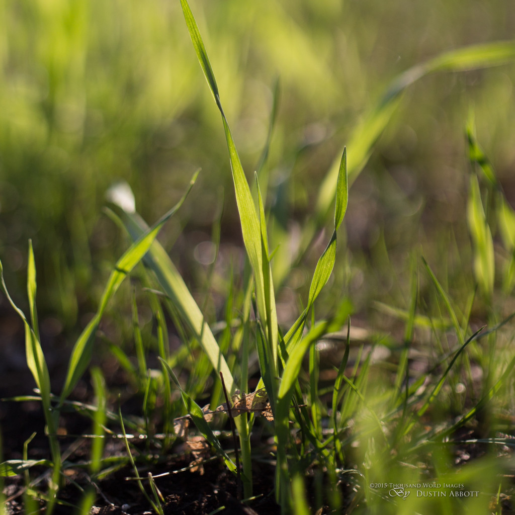
One key to great drawing from a lens is not just in the size and shape of the bokeh highlights but also in the fine transitions from focused regions to defocused regions. I prefer a smooth transition that eliminates nervousness and produces a very artistic look. Take a look at this near 100% crop from one of the images above. It mixes focus (on the blades of grass in the foreground) to the eventually completely defocused region beyond. But look at how nice the transition is in this untouched image:
Put simply, this lens represents the pinnacle of what a normal (50mm range) lens can accomplish. The only lens I’ve used that I feel tops it is the Otus 85mm. I slightly preferred the 85mm, but that is more about my preference for the 85mm focal length compared to the 55mm here. Many of you may prefer this lens because you prefer the focal length and the ability to use a wide range of standard sized filters in the 77mm focal length.
Who is the Otus for?
Someone who wants the optical best. The new Sigma 50mm f/1.4 ART is quite good, but nothing compares to the Zeiss Otus series for wide open performance. If you need ultimate low light performance, the Otus offers perfect sharpness and contrast wide open. With a move towards high megapixel bodies (Canon 5DS, for example) the Otus is one of the few lenses that can take full advantage of the near medium format resolution that these new bodies produce. This is a lens that is built for a lifetime of shooting, and I’ve encouraged potential buyers in the past to consider an Otus purchase more of a long term investment than an impulse buy. As I noted with the Otus 85mm review, one should really price compare more with medium format lenses and systems, as the Otus line produces images that have a look more like MF systems.
Videographers should also take a long look at this lens. Nothing compares to the focus smoothness and accuracy of these Otus lenses, and they are a dream to use for video use.
I would also encourage high end portrait and fashion photographers to take a look at this lens. It will give you uniquely special portraits at large apertures that can set your work apart. It will also allow for large reproductions even at large apertures due to the intense resolution. Wedding photographers should also consider this lens for its low light performance and as a unique posed shot lens that will set your work apart.
There are a number of alternatives to consider, and I’ve reviewed a number of them. Here are some links to my reviews of potential alternatives:
Zeiss Otus 1.4/85mm Review
Zeiss Makro-Planar T* 2/50mm Review
Zeiss Planar T* 1.4/50mm Review
Sigma 50mm f/1.4 ART Review
Canon EF 50mm f/1.2L USM Review
I would also recommend checking out the Lens Image Gallery to see many more samples (including some full size samples).
Conclusions
The Zeiss Otus 1.4/55mm is unique lens. It is a study in extremes: size, resolution, and price are all uniquely large for a 50mm lens. Many photographers will immediately dismiss this lens due to those extremes, but some of you will feel drawn to the lens for those same reasons. No one is trying to pretend that the Otus lenses are for everyone, but don’t dismiss them as overpriced hype, either. The Otus lenses are the real deal. The Otus 55 represents the pinnacle of what is currently achievable in a wide aperture normal prime. It is a superlative instrument in every detail, and manages the rare feat of combining extraordinary resolution with beautifully artful drawing and rendering. I’ve reviewed ten modern 50mm lenses and an additional 6 or so legacy 50mm primes, and none of them compare to the standard set by the Zeiss Otus 1.4/55. It is unquestionably the best.
Pros:
- Incredible resolution starting at f/1.4
- Incomparable contrast
- Beautiful, artful bokeh and drawing
- Robust, elegant, functional design using exceptional materials
- Very smooth and accurate focus ring
- Uses standard 77mm filters
- Complete lack of distortion and chromatic aberrations
- Sharpness is consistent across the frame and the focus range
Cons:
- Price
- Weight and size
- No autofocus. No weathersealing. No case included
- In some rare situations some “onion bokeh” effect is seen
- Price (yes, it needs to be on the list twice!)
Review notes: I want to thank Zeiss of the Americas for providing a retail copy of the lens for review purposes. They are a joy to work with.
Gear Used:
Canon EOS 6D DSLR Camera (Body Only)
Zeiss Otus 55mm APO Planar T* 1.4/55mm
Adobe Lightroom CC Software for Mac and Windows (Boxed Version)
Adobe Photoshop Creative Cloud 1-Year Subscription
Alien Skin Exposure 7 (Use Code “dustinabbott” to get 10% anything and everything)
Purchasing your gear through B&H and these links helps fund this website and keeps the articles coming. Thank you for your support.
Great News! I can now offer a 5% discount on all purchases at Amplis Foto, Canada’s Leading Photographic Supplier. Please enter discount code: AMPLIS52014 in your cart. It is good for everything in your cart, and is stackable with other coupons, too! It will take 5% off your entire order! Proceeds go towards keeping this site going and providing you with new reviews!
[contact-form][contact-field label=’Name’ type=’name’ required=’1’/][contact-field label=’Email’ type=’email’ required=’1’/][contact-field label=’Website’ type=’url’/][contact-field label=’Comment’ type=’textarea’ required=’1’/][/contact-form]
DISCLAIMER: This article and description contains affiliate links, which means that if you click on one of the product links, I’ll receive a small commission. As an Amazon Associate I earn from qualifying purchases.
7 thoughts on “Zeiss Otus 1.4/55mm APO Distagon T* Review”
Leave a Reply
You must be logged in to post a comment.














 Tamron RF 11-20mm F2.8 RXD Gallery
  Tamron 11-20mm F2.8 RXD for Canon RF Review
  Yaber K3 Smart Projector Review
  Sirui Aurora vs Sigma DN 85mm F1.4



Nice review.
However, my impression is that the sharpness / IQ is not really exploited on existing Canon f.f.'s like the 6d or 5d3 with relatively low resolution and DR. I would think it would take a Sony 36mpix Exmor (such as A7r or Nikon D810) to really justify an Otus.
I'll be interested to read reviews of the Otus on the 5Dsr.
That’s true, to a certain extent. A 20(ish) MP sensor isn’t going to take full advantage of the resolution, but you definitely see a big difference in the image quality nonetheless. With a lens like this, however, you aren’t just buying for the camera you have now. It’s a lens that I would buy and pretty much keep for life.
“It’s a lens that I would buy and pretty much keep for life.”
This comment has me struggling.. I now own a lot of 50mm lenses and am considering to sell them all (after completing the purpose of my blog) and buy a “real keeper” Monster McFifty.
However, even if I get really great prices for my fifties, I won’t even have half of what is required to get a USED Otus.
On the other hand, I really, really love this lens and what it can do.
Hi Dustin,
Great review and a simply gorgeous lens. The price to match unfortunately. Have you seen/used the Sony FE 55 1.8 ZA lens? How would you compare the two? I’ve just moved over to Sony from Canon and have this lens and although it’s only a 1.8, the sharpness, contrast and bokeh are fantastic.
I don’t have a lot of experience with the Sony lenses, but the Otus line is record breaking!