Every photographer loves shooting when the conditions are easy and the light is great. Traditional portraiture has taken place in studios where the lighting and conditions are easily controlled, consistent, and repeatable. Once the initial investment of effort has been made, it is relatively easy to go from shoot to shoot and make minor adjustments. Some studio portraiture is amazing, but I have skewed more towards the higher risk yet higher reward of environmental portraiture. I’m an outdoors person (despite the fact that my chosen vocations keep me indoors much of the time) and I enjoy shooting outdoor portraiture the most. The problem with this, however, is that the difficulty level ramps up because no two sessions are the same. For that matter, it is entirely usual for conditions to change even in the middle of a session. It keeps you on your toes!
There are some things that you simply can’t control, so developing the ability to enhance the mood of your work through effective post processing is very important. In the instance of this particular series (and the image we will focus on), it was a spur of the moment request at a time when I was not packing any additional equipment. I had my camera…and that was it. No lighting, no modifiers, no reflectors. Natural light in a natural setting.
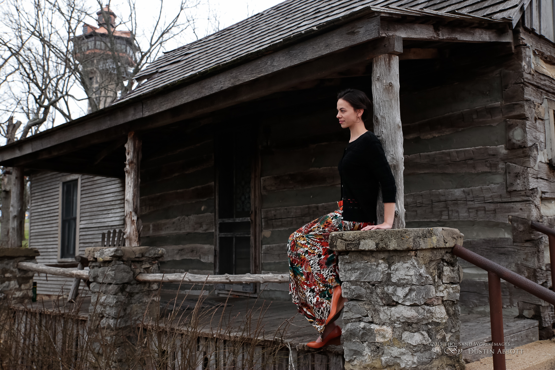
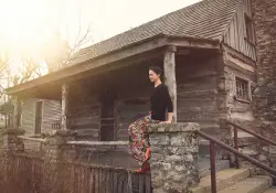
This young lady had just recorded a new single in Nashville and needed something for iTunes and other digital distribution. We had seen this cool historic cabin driving along (Old Matt’s Cabin at Shepherd of the Hills outside of Branson, Missouri) and agreed that it would be a very cool location. The day (and light) was fairly grey and flat. The good news is that it was already diffused, so I was able to get a pretty balanced exposure to start with.
The environment was great, with the exception that you can faintly see a tower for a zipline adventure in the background above the cabin. There are some great textures in the old cabin. The lighting and the setting was fairly moody already, but lacked nuance. It needed some punch, particularly for an album cover type shot that needs to be something other than “vanilla” to stand out. Her wardrobe had some nice vibrant colors to help her stand out, which was good since I had no means of adding light to her.
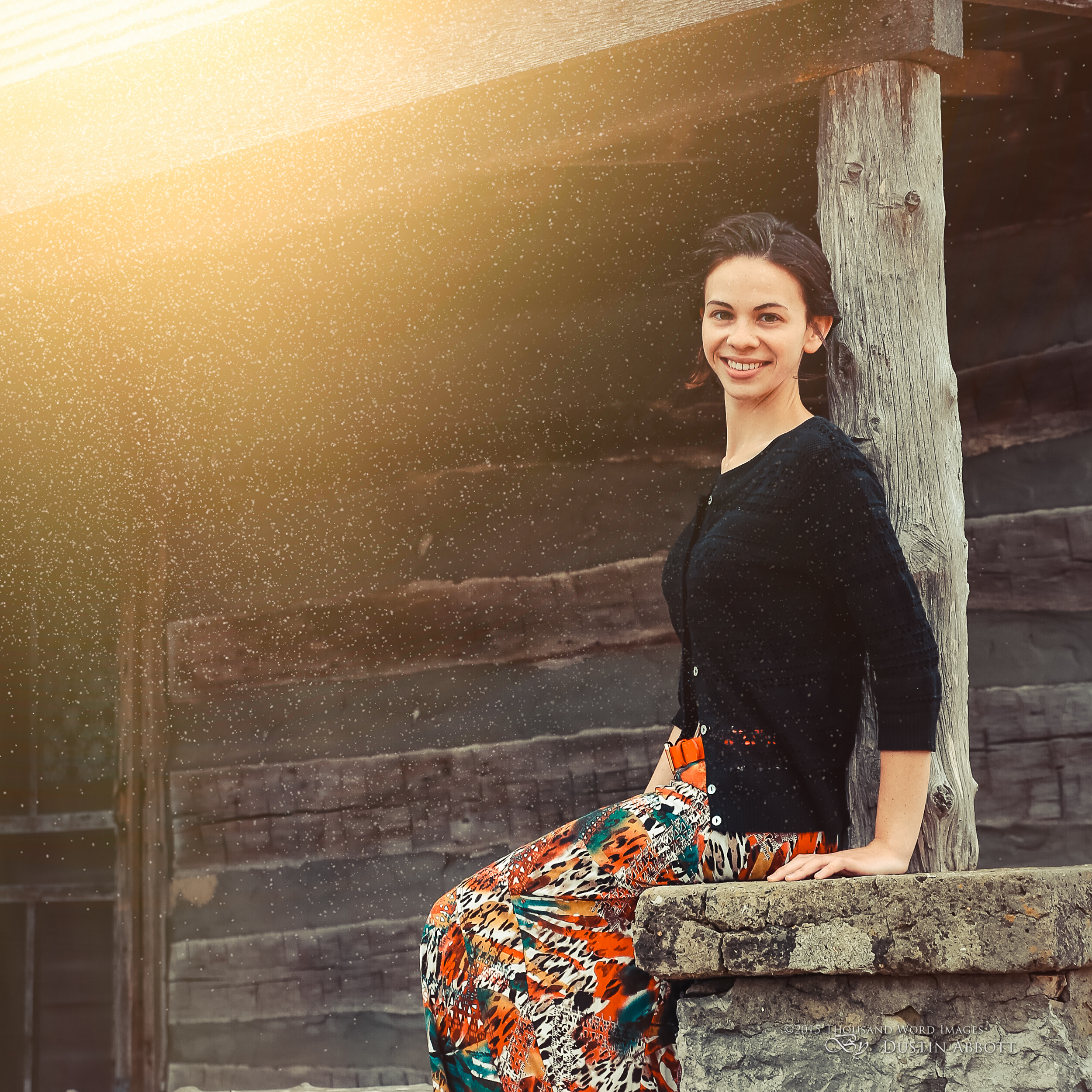
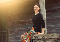
I actually processed the series in two different direction to give her options for what mood she wanted to go for. In the example below (which is actually what she ended up choosing), I elected to add some warmth to the scene through color temperature, softening the tone curve to give it a slightly faded look, and then adding flare and dust motes (through my own overlays that I’ll reference below). I placed the flare in such a way as to diminish the distraction of the zipline tower in the background.
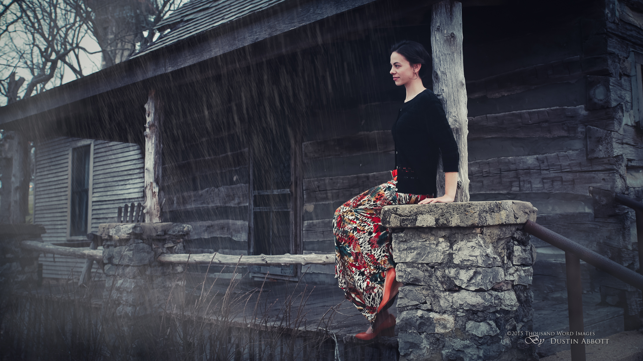
But the main image that I want to examine is one that I took in the opposite direction when processing. I elected to have my subject looking away from the camera, and to me her body language ended up looking a little more wistful. I wanted to make the look of the photo more brooding and moody in case that might suit her artistic direction. I still needed to deal with the same issue of the distracting tower. I used three different pieces of software in my workflow: Adobe Lightroom, Adobe Photoshop, and Alien Skin Exposure. These are my go to programs for processing workflow, and while I “flirt” with other software, these are the ones that I’m “married” to.
I always start in Lightroom. If I could own only one program, it would be this one (although it would be tough to live without Photoshop!) The good news for photographers these days is that Adobe has a Photography subscription that includes both programs for about $12 a month, which is a great value when you consider how expensive the software was to buy outright. It is here that I apply the initial presets for lens corrections, metadata, and basic settings on import. It takes me no additional time other than selecting the appropriate preset for metadata and develop settings before the import process. By the time I actually start to process the image it has already been corrected for perspective distortion, chromatic aberrations, and had some basic adjustments for sharpening and the tone curve. In Lightroom’s Develop module I made a few further adjustments, including softening the tone curve and raising the shadows to give it a slightly faded, “creamy” look. I also changed the color temperature (cooler) and then added a hint more mood through split toning (cool shadows and a hint of warmth in the highlights). I also started attacking the zipline tower issue by changing my crop to a 16:9 ratio that de-emphasized that portion of the image. I then took the image into Photoshop (I always return to Lightroom in the end for final tweaks to the metadata including description and keywords).
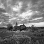
In Photoshop is where the real magic begins. After realizing that adding environmental effects is time consuming, I began to develop a series of overlays using both Photoshop effects and also photographic effects that I have shot for (for example, images taken just of different rain and snow conditions against a black setting). The rain here, for example, only took a minute or two to add by just opening the folder of where I keep these effects and then dragging them onto the image, selecting the placement, and then changing the blending mood to “Screen” so the black disappears and only the light portions (the rain) shows. Here is what one of those overlays look like:
Doesn’t look like much, right? But the blending mode is what makes the magic happen. The extra convenience of this approach is the ability to add a mask and paint out the effect where you don’t want it – like around her face. I also added some mist to areas I wanted it to further enhance the mood (and yes, the mist can be added through my overlays as well).
I prefer to launch Alien Skin Exposure (I’m using version 7, the newest – if you use the coupon code “dustinabbott” you can get 10% off all Alien Skin products) through Photoshop because it gives me the ability to use blending modes and masks to customize the final result if I want to. My work in Exposure is fairly minimal here. What I did add was a warmer preset at a low opacity that gave a little more color complexity to the image. The greatest challenge with a cool, moody portrait is to keep the skin tones from getting too “corpse-like”, and so I often try to keep a little warmth on the skin tones even as I cool the image. Alien Skin helped me quickly do that.
I returned to Photoshop, and, when I was happy with the finished result, I did something that all the experts would tell you not to do: I flattened the image. The experts are right; in Photoshop this means that you lose the ability to go back and edit those steps you have made. But I (probably like you) live in the real world. Every month I take thousands of images between my personal and professional work. I will advance edit at least a hundred of those. An unflattened image with multiple layers can take up 500-1000MB; the same image when flattened takes up about 100MB. I burn through a lot of storage as it is, so I rarely leave images unflattened unless I actually know that I will need to go back to them for some reason. That may not be good advice, but I have decided the benefits for me outweigh the liabilities of this approach.
The end result here has a lot of processing steps, but thanks to the use of the overlays for these environmental effects, my total processing time only took me 15 minutes or less. The image here was not the one that my client chose (for now), but is one that I’m happy to add to my own portfolio.
Here are a few others from the series.
Sound off in the comments below if you would be interested in my making these overlays and a tutorial on how to use them available at a reasonable price.
Gear Used:
Canon EOS 6D DSLR Camera (Body Only)
Tamron SP 24-70mm f/2.8 Di VC USD
Adobe Photoshop Lightroom 5 Software for Mac and Windows (Boxed Version)
Adobe Photoshop Creative Cloud 1-Year Subscription
Alien Skin Exposure 7 (Use code “dustinabbott” to get 10% off)
Purchasing your gear through B&H and these links helps fund this website and keeps the articles coming. Thank you for your support.
Great News! I can now offer a 5% discount on all purchases at Amplis Foto, Canada’s Leading Photographic Supplier. Please enter discount code: AMPLIS52014 in your cart. It is good for everything in your cart, and is stackable with other coupons, too! It will take 5% off your entire order! If you want to go directly to this lens, click here: Proceeds go towards keeping this site going and providing you with new reviews!
Error: Contact form not found.







Dustin, great Job! I live the composición you have choose for the pics. Thanks for sharing your workflow, it' interesting knowing that…
Best regards!
Juan Pablo Bialade
Thank you, Juan. Happy to share!
excellent walk through, i for one have a whole stack of Images taken on such overcast days sitting in my hard drive waiting to be brought back to life. Your post has inspired me to look at what might be salvaged. I am rarely motivated to write comments on web sites, but felt that your explanation and thinking required me to do so. Thank you for taking the time and energy to share this.
Thanks for writing, Jerome. Happy to provide a little inspiration.
Hi Dustin,
you have really interesting content on your site. I enjoy reading your blog, and I have been following it for quite a while. Thank you for this article and for all the other posts.
May I ask if you offer a tutorial on how to create the photos of rain or snow that you use as overlays? I would love to learn more about it.
Thank you, and Happy New Year (as it is January 2nd today) 🙂
Matthias